andrea's portfolio > cost optimization hub preferences and enhancements

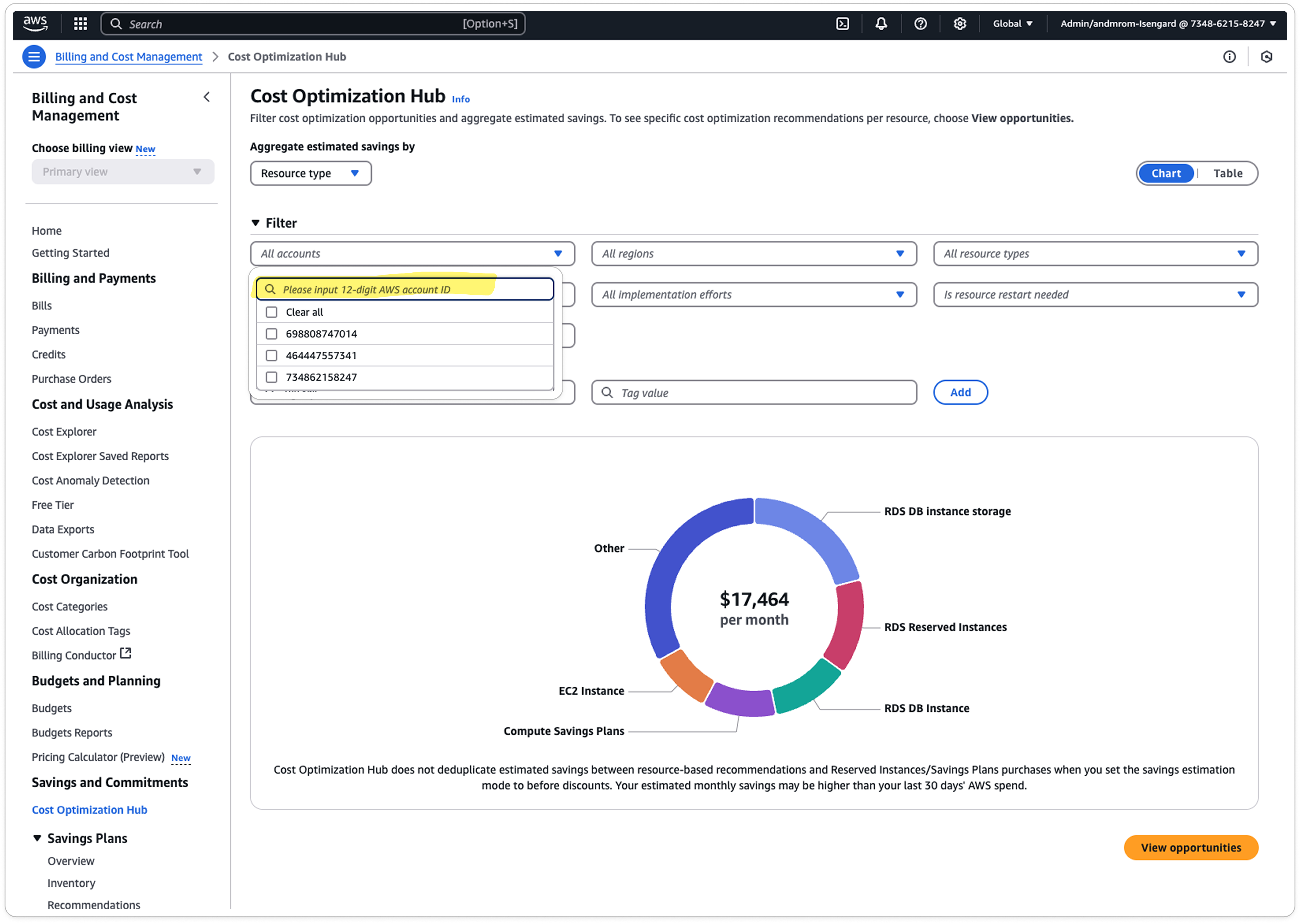
Restoring customer control and clarity on Cost Optimization Hub

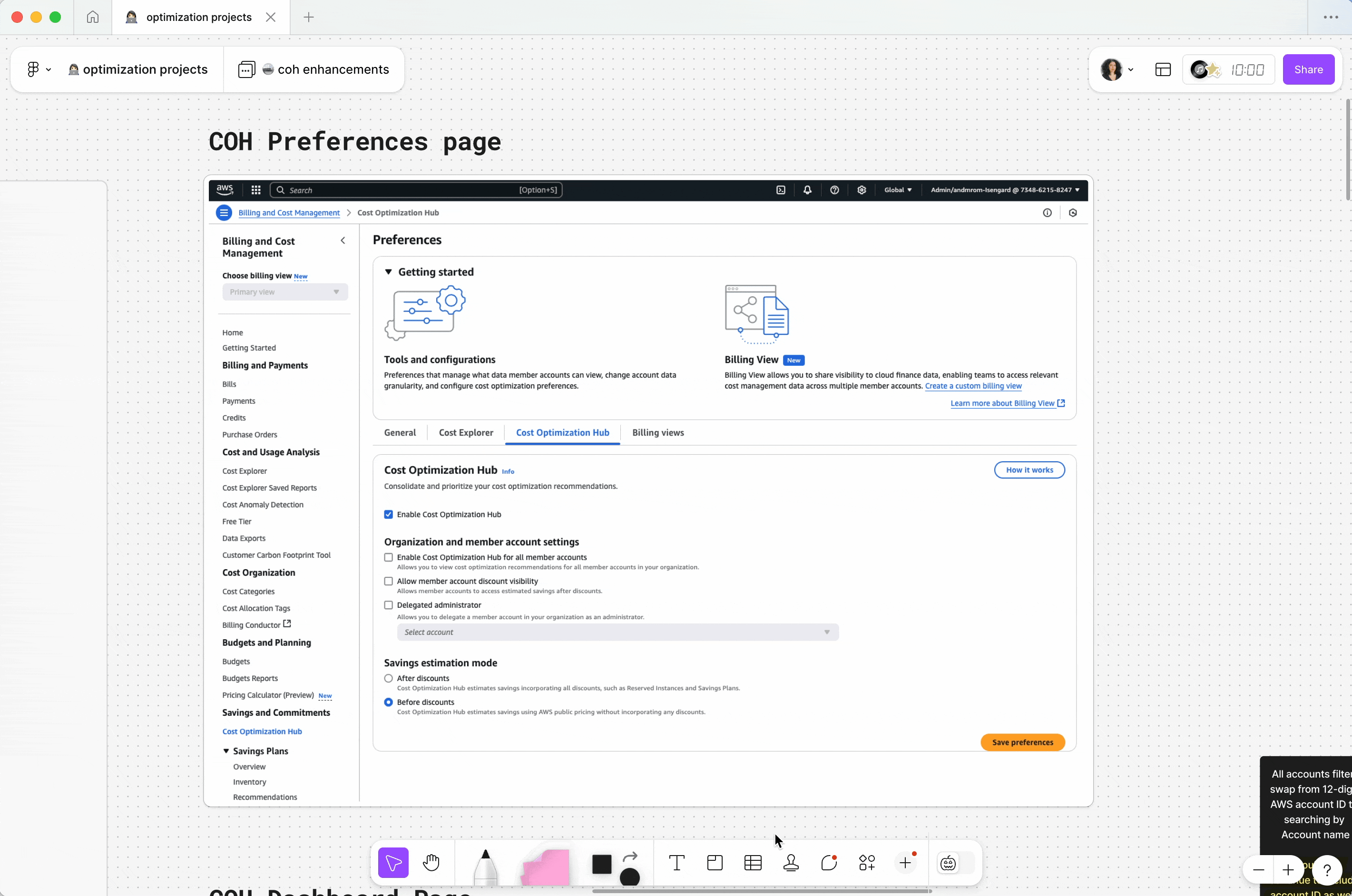
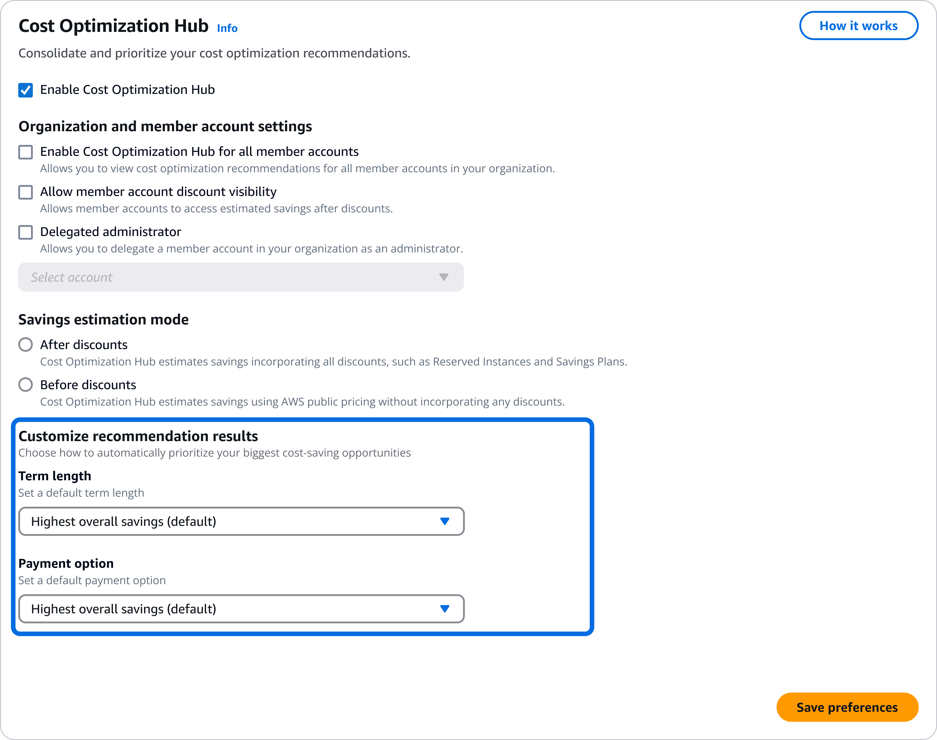
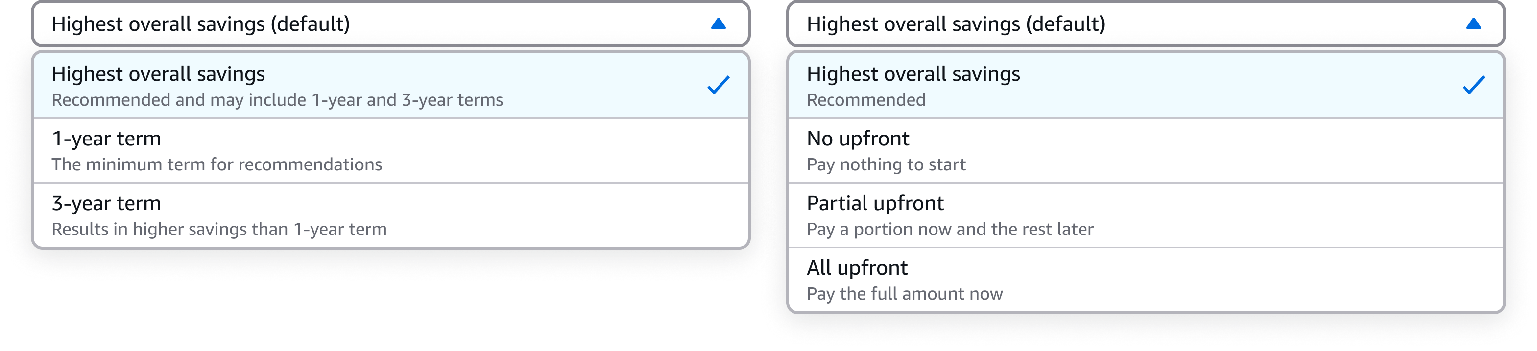
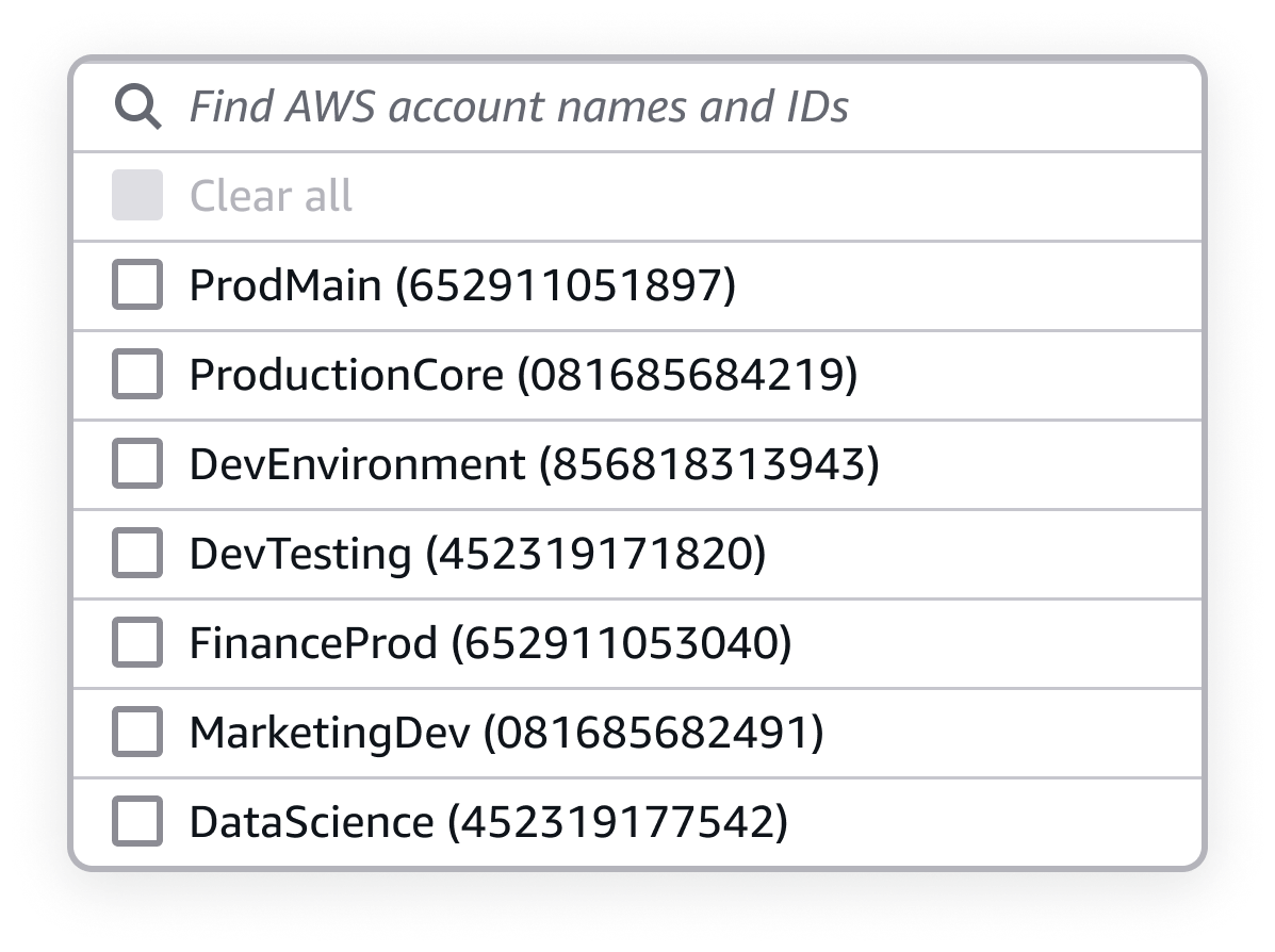
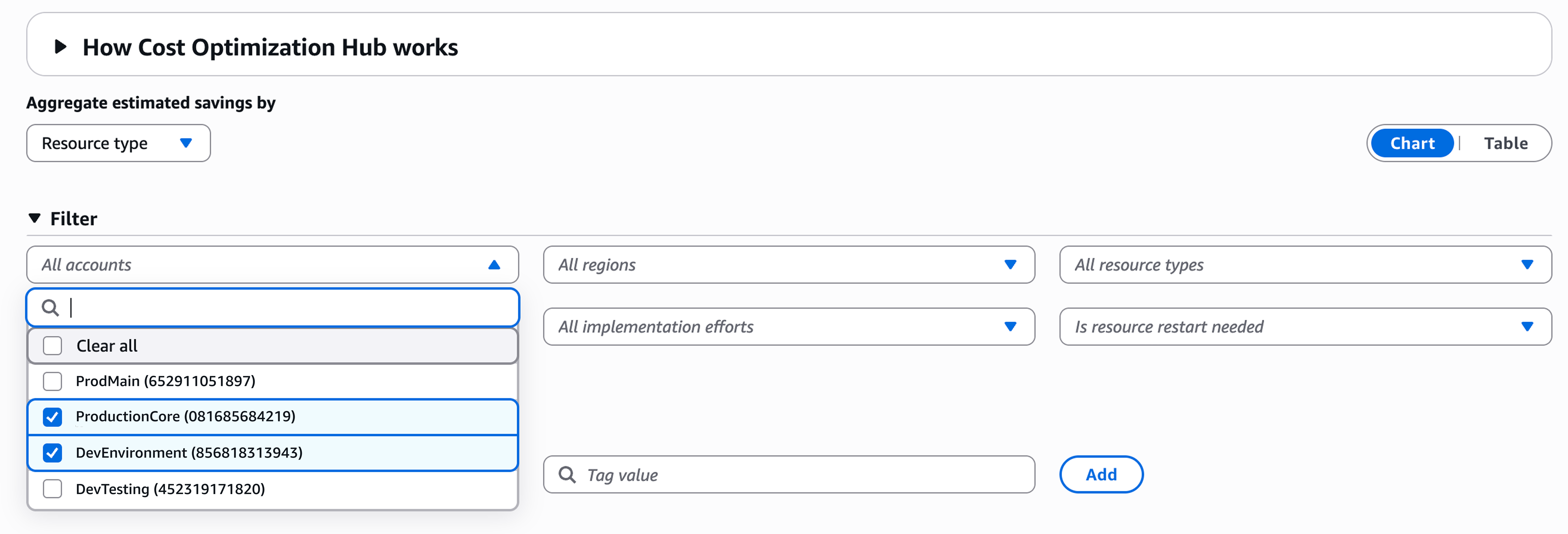
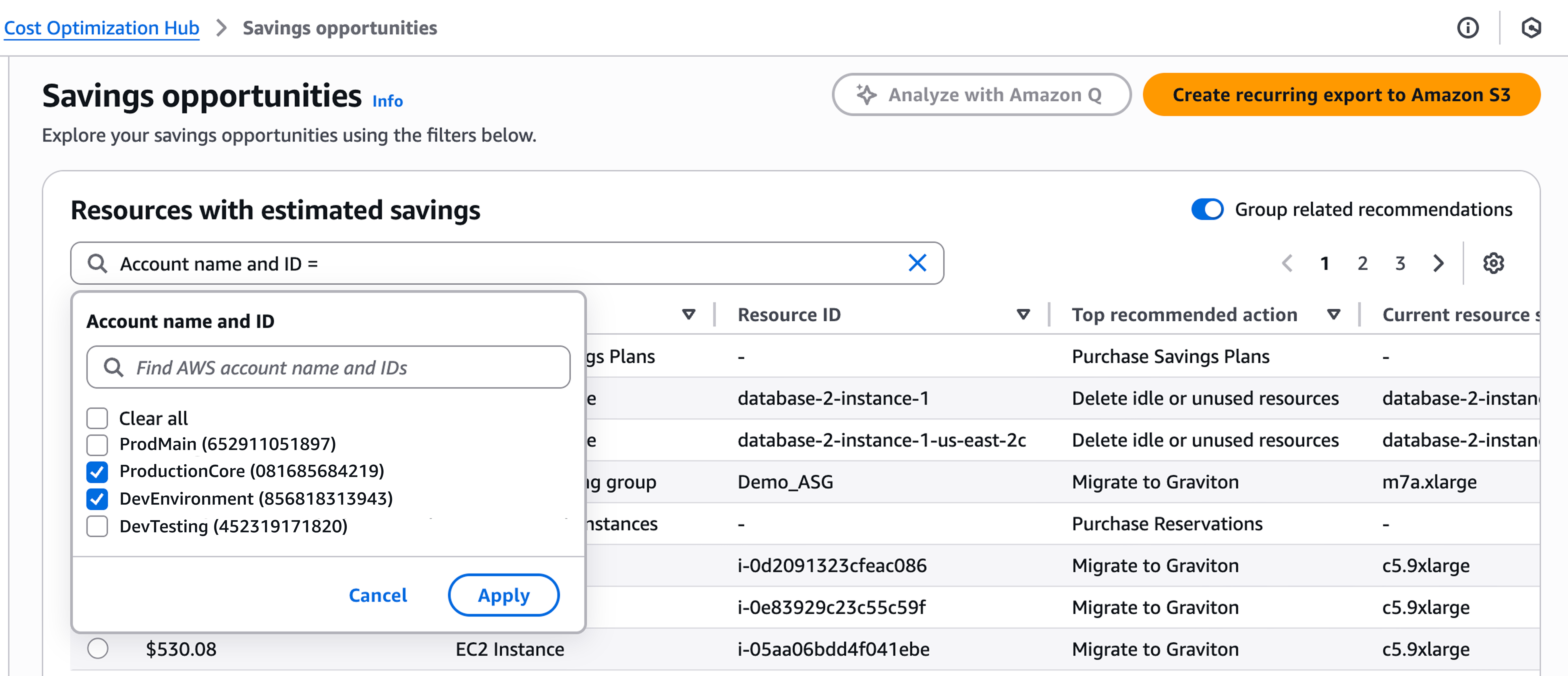
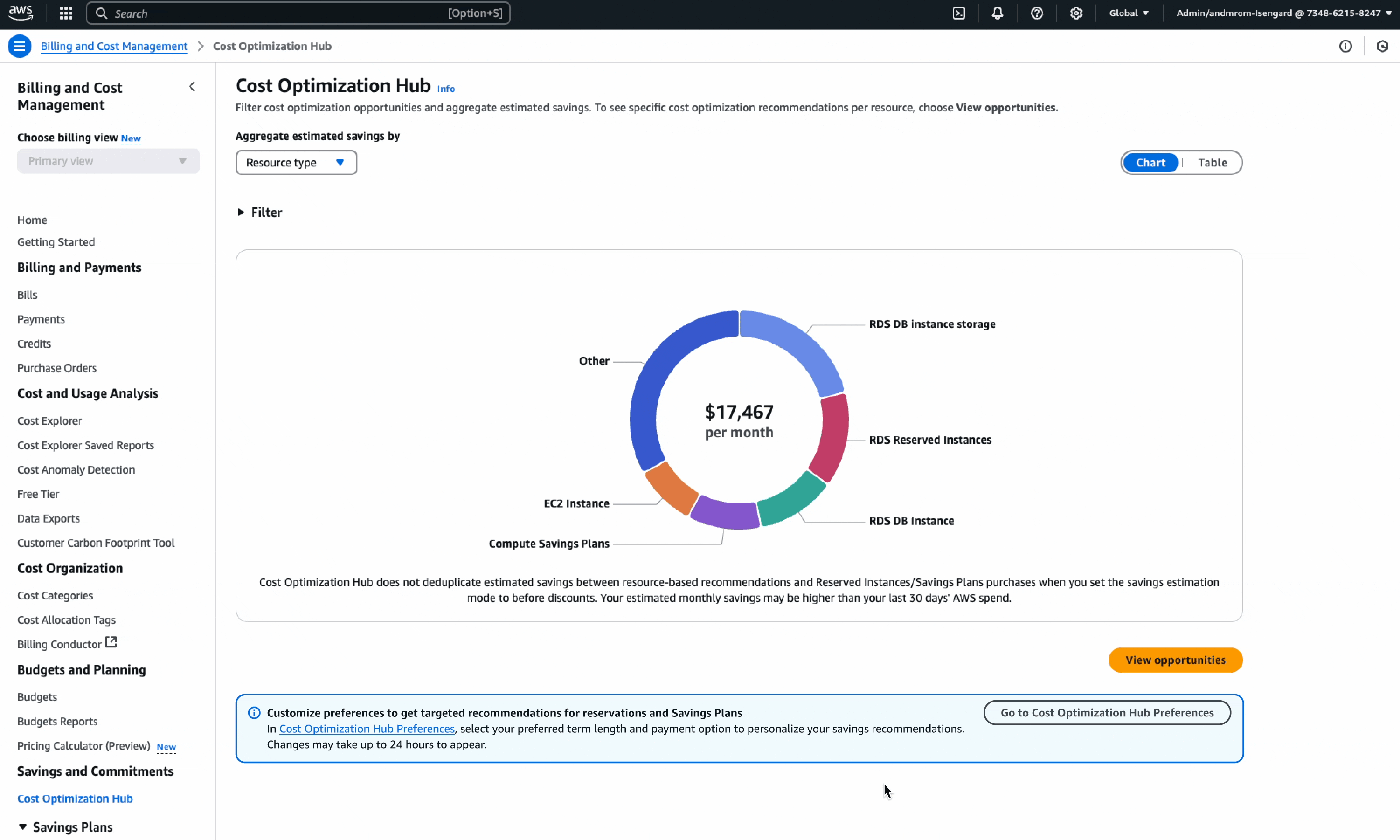
In 2025, I led the redesign of the Cost Optimization Hub preference settings at AWS, aimed at reducing financial anxiety and restoring customer control over high-stakes financial commitments like Savings Plans and Reserved Instances. This project also established an innovative console pattern for displaying customer account names and IDs, reducing cognitive load and driving consistency across the entire AWS Billing and Cost Management console.

Launch announcements: https://aws.amazon.com/about-aws/whats-new/2025/05/cost-optimization-hub-savings-plans-reservations-preferences/

https://aws.amazon.com/about-aws/whats-new/2025/07/cost-optimization-hub-account-names-optimization-opportunities/

The customer problem

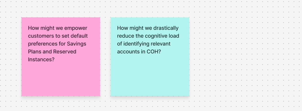
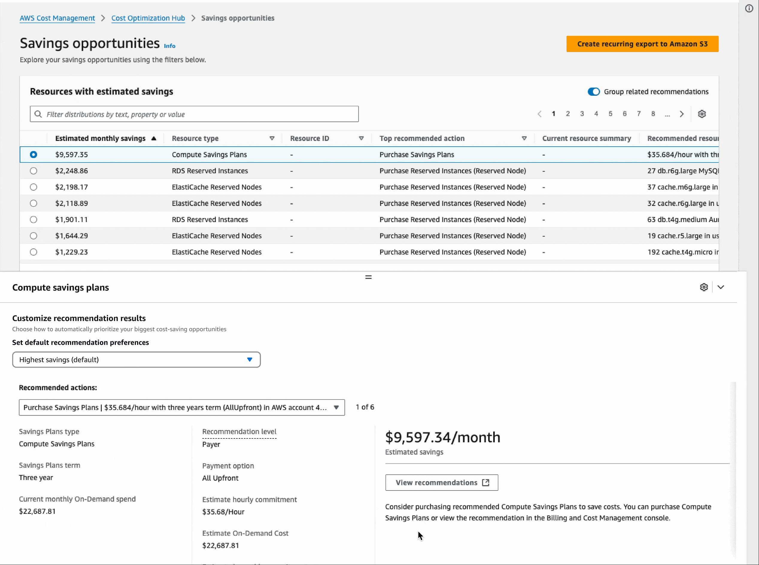
AWS FinOps customers faced significant decision paralysis when reviewing Cost Optimization Hub recommendations. The sheer volume of suggestions led to cognitive overload, resulting in delays or abandonment of critical cost-saving actions.

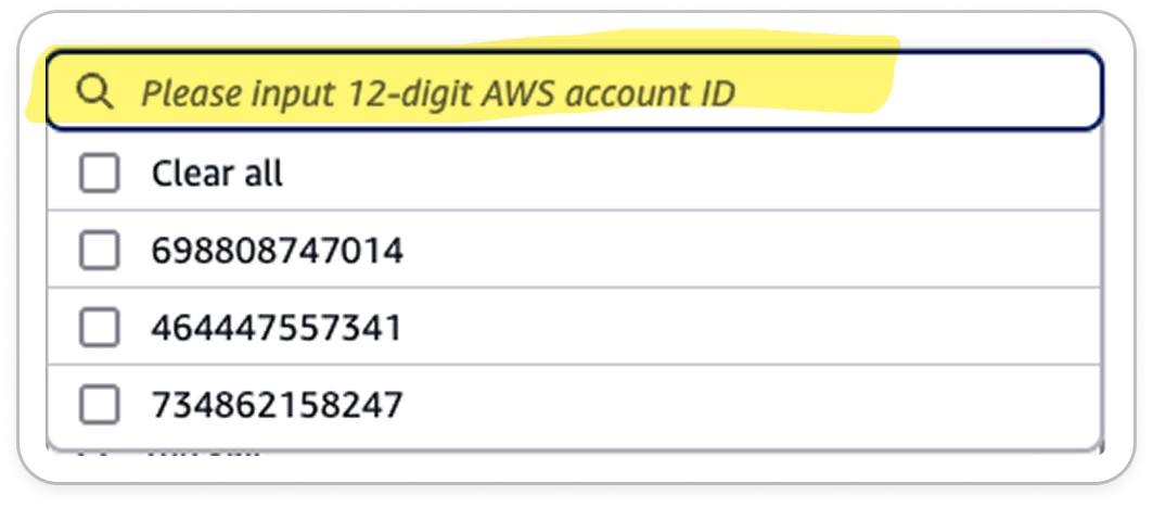
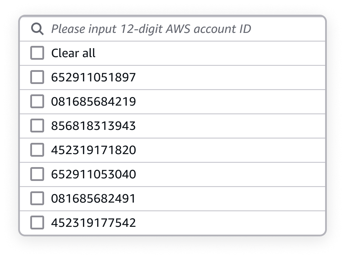
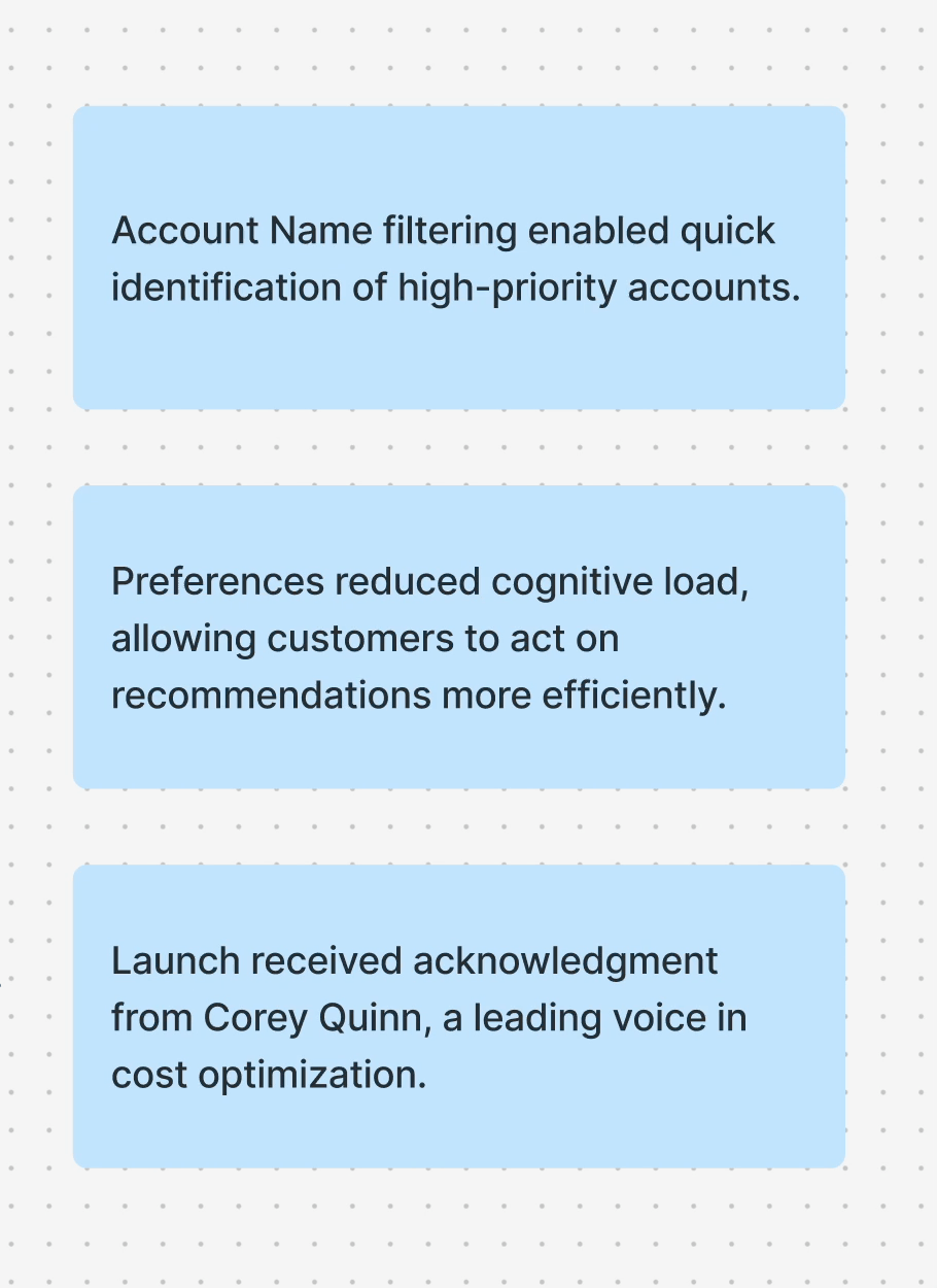
Compounding this, reliance on account IDs alone to correctly identify accounts required manual data cross-referencing, severely eroding customer trust and preventing reliable, actionable guidance.

My role

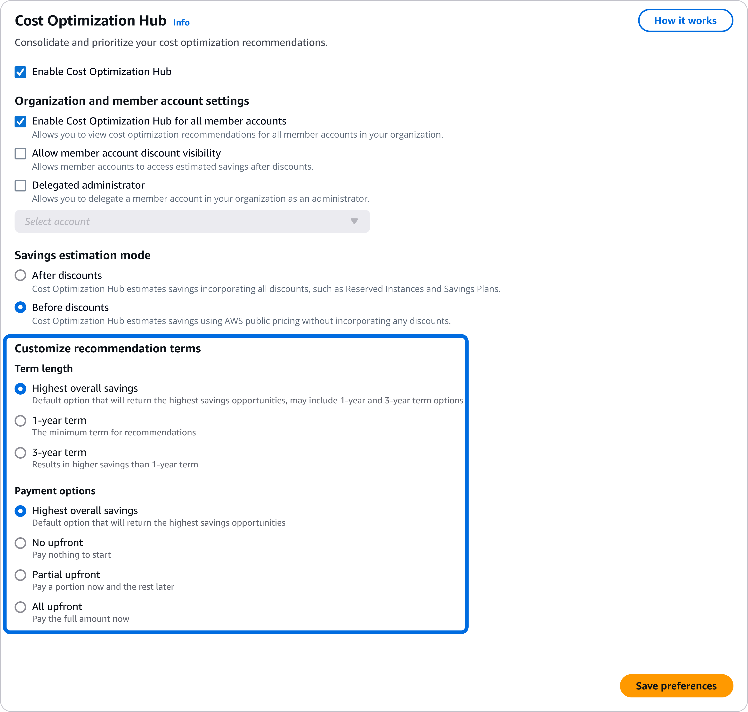
My challenge as the sole UX designer was to humanize the complexity by redesigning preference flows that empowered customers to proactively set default term and payment options. Additionally, I was tasked with enhancing our Account filtering by adding Account names alongside Account ID’s for easier account identification.

Tools & skills  

⟡Pen ⟡Paper ⟡Figma ⟡Research ⟡Sketching ⟡Prototyping

Kickoff & framing the problem

My kickoff involved auditing the COH recommendations page and the existing Account Preferences tab to map the current customer workflow. The goal was to diagnose the source of customer friction and hesitation within the existing flows.

Cost Optimization Hub preferences tab

This initial audit led to three guiding questions that framed our solution space and defined success:

Enabling customers to set default preferences

The initial design challenge was centered on placement tension. I asked the question, “Should new preferences settings interrupt the core recommendations flow, or be integrated into the low-traffic preferences tab?"

Customer insights

To answer this, I led discussions with the product team to explore this trade-off.
We surfaced a crucial "one-and-done" customer insight: customers treat preference settings as a one-time activity, rarely needing to change them later.

Based on this low-frequency usage insight, I decided that placing a prominent preferences selector on the main COH recommendations page would create visual noise and be a disturbance to the customer workflow. To test this out, I created a high-fidelity prototype exploring this layout.

Testing a prominent Savings Plans preference selector on the main COH page to assess visual noise and customer distraction.

The design choice

Instead, I integrated the preference options into the existing, low-frequency Preferences tab within the Account Management page. This aligned perfectly with the customer's "one-and-done" mentality.

For scalability, I validated a pattern using expandable dropdown components over simpler radio buttons. This pattern ensured the design wouldn't overcrowd existing options and could easily accommodate future preference types, all while leveraging customer familiarity established in existing Savings Plans purchase experiences.

Driving adoption

To ensure discoverability, I implemented an informational alert component on the main COH dashboard. This included a call-to-action (CTA) that actively prompted and guided first-time users directly to the preferences tab. Upon successfully setting preferences, a flash bar indicated success and provided an immediate CTA to navigate users back to COH to see their newly personalized recommendations.

As a result, this design restored customer control, transforming financial recommendations from intimidating mandates into flexible, personalized guidance.

Collaborated with our technical writer to draft content that clearly explains preference processing times and expected outcomes, reducing confusion around potential edge cases.

Complete journey detailing the discovery alert, configuration of scalable preferences, and the final flashbar confirmation that returns the customer to personalized recommendations.

The account filtering UX paper cut

In parallel, I addressed a critical UX paper cut within the account filtering mechanism in COH. The existing filter dropdown only displayed raw 12-digit Account IDs, forcing customers to rely on memorization or external spreadsheets to identify high-priority accounts. This violation of the design principle of recognition over recall directly contributed to high cognitive load.

I initiated a collaboration with engineering to assess the technical feasibility of surfacing Account Names alongside their associated IDs. The engineering team implemented necessary API updates, enabling the data transfer required for this enhancement.

Pattern recognition and standardization advocacy

Rather than designing a new component, I recognized a foundational pattern already being developed by another Console team: Account Name (Account ID). This developing standard established the Account Name and ID as the primary, scannable identifier and provided immediate external consistency.

The primary identifiers for an account is made up of the account name and ID. Account name is more easily recognized by users, but having the two elements displayed together will help reinforce the connection between them.

Scaling the solution

My focus shifted to advocacy. I successfully advocated for the adoption and application of this standardized pattern across all Billing and Cost Management experiences, ensuring customers had a consistent, predictable filtering experience, regardless of which tool they were using. This transformed a feature-level fix into a console-wide accessibility win.

Impact and metrics

These two enhancements, personalized preferences and enhanced account filtering, were launched at the 2025 FinOpsX conference in San Diego. The launch was met with immediate, positive customer and industry feedback.

Measurable improvements

Reflections & learnings

<01> Small changes have outsized impact, even minor enhancements like account name filtering dramatically improved the customer experience and workflow.

<02> Efficiency drives adoption, personalized preferences increased the likelihood that customers acted on recommendations, directly boosting engagement and adoption for AWS.

<03> Collaboration strengthens outcomes, exploring multiple solutions, understanding API constraints, and supporting engineering through launch reinforced my stakeholder collaboration skills.

<04> High-impact launches don’t need to be massive, even incremental FinOpsX launches can provide significant, measurable value for customers.

Thanks for reviewing my process.

I would love to continue the discussion on how human-centered standardization can reduce cognitive load and ensure user control across complex systems. Feel free to email me or send me a message through LinkedIn.